Index
Case
01 of 05
Xeneta
2022 to 2026
Xeneta Brand Transformation
Establishing authority at first impression, so the commercial team confirms a position rather than argues for one.
Role
Brand & Design Manager. Design and creative strategy through to execution, identity, design system, art direction.
Context
Moving upmarket. New pricing structure, larger contracts, more senior buyers.
With
Product marketing, campaigns, demand generation, sales enablement, product and tech.
Year
2022 to 2026
Xeneta is the category leader in freight intelligence. In 2022 the brand did not communicate that, and it did not support the price the company was about to start asking for.
A stronger product and a revised commercial strategy were moving Xeneta materially upmarket: higher pricing, larger contracts, more senior buyers.

Xeneta BEFORE THE REBRAND
Caption goes here
01
Context & challenge
In B2B, that perception is formed before sales gets involved, making brand the first proof point.
However, the brand was working against it. Xeneta had inherited the visual language of traditional freight industry, so it read as a shipping business at the point it needed to read as the definitive source of market intelligence.
The challenge for the bran
Establish authority and credibility at first impression, so the commercial team confirms a position rather than argues for one.
My role
I led the design and creative strategy for the rebrand, from identity through to implementation across every surface. Positioning was set in collaboration with the VP Marketing, VP Product and product marketing. My job was to translate our positioning across the brand. That covered the identity, the design system, the art direction, and the copy and messaging on the materials being shipped through.

NEW BRANDING OVERVIEW
Approach
Three jobs for the identity
Xeneta is not a traditional freight company. It sells data and software into an industry that does not buy much of either, and the identity it had seemed more like the category it was selling into rather than the one it was leading.
It had to read as premium software rather than logistics, so that price and product were consistent with each other. It had to carry credibility on sight, because when the product is data, credibility is the first thing being judged. I also wanted to add some dynamism in its identity, to reflect the company mission in changing how freight is bought and sold. A static, conservative identity would have undercut both claims before anyone read a word.
OTHER Considerations
It had to work in other people’s hands. The people making most of Xeneta’s day-to-day material are not designers, and they need to move quickly. The system had to let them build their own presentations and assets and get a consistent, on-brand result without asking anyone, which is the only way brand consistency holds across an organisation this size.
It had to present data credibly. Data is the product, so I treated its presentation as a trust problem rather than a styling one. Charts, figures and platform imagery had to carry authority and credibility.
It had to rebrand without losing recognition. Far enough to distinguish agains other traditional freight companies, keeping certain elements of the brand that customers read evolution rather than replacement.
Design decisions
Move away from the category palette. Orange and navy are the conventional colours of freight. A deeper purple with lilac and lime reads as premium software, stays recognisable against the previous identity, and was not occupied by any direct competitor.
Rebuild the website first, with the platform visible. The website is where a buyer researching the category forms their view unprompted, and it had the widest reach of anything we controlled. It was running low-resolution product screenshots, which understated the product. High-quality platform imagery made the technology itself the argument.
Set the chart standards. Charts appear in more places than any other asset and are the hardest to correct once they are in circulation, so data visualisation rules were fixed first and the rest of the system built to match them.
Audit first, then decide what to template. I went through what the company was actually producing, week by week, and separated the work that repeats from the work that is genuinely new each time. Only the repeating work got templated. Everything that shipped was then tested on the balance of ease of use and adhering to to the guidelines, because a template nobody can operate does not get adopted, and an unadopted template does not protect the brand.
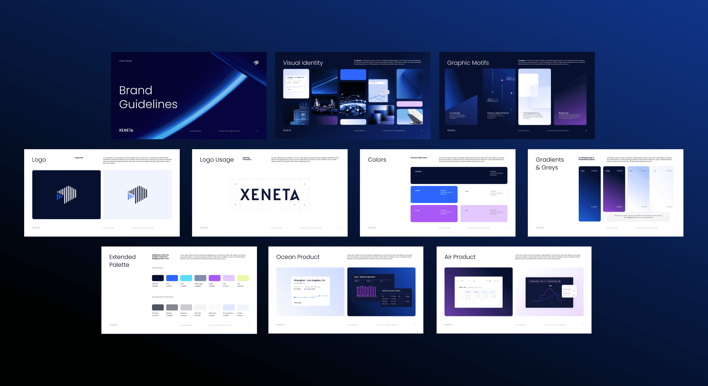
NEW BRAND GUIDELINES


WEBSITE REDESIGN

SAMPLE APPLICATIONS

IMPLEMENTED ACROSS ALL ASSETS LIKE DECKS, BROCHURES, REPORTS, AND MORE
How it evolved
The identity was the shorter part of the work
Designing a system a non-design organisation could use without degrading it took another three years.
Period
What I built
What I learned
What it changed
2022
Identity
Rebrand and 2023 website revamp. Palette, typography, motif system, platform photography.
A strong identity is not automatically a usable one. Designing for how it would be handled by other people became the brief for everything after.
A brand the company could stand behind at the new price point.
2023–24
Systems
Consolidated a fragmented library into one system: 50+ decks, 10+ one-pagers, emails, brochures and templates. Figma workflows, PowerPoint and Word templates, icon and chart standards.
Templates get adopted when they are faster than the alternative under real time pressure. That reframed the work from designing assets to removing friction.
A consistent baseline, though every high-quality asset still came through me.
2025–26
Encoded
When the company adopted Claude and other AI tools, brand tooling became possible for the first time. I built it: a brand skill, a presentation builder with buyer-journey logic, and chart and one-pager builders, with the guidelines extended past visuals into story, positioning and tone.
Tooling only works if someone owns the judgement inside it. I set the rules the builders run on and maintain them as the brand and product change, which is what keeps the speed from costing consistency.
Teams generate on-brand material at a speed we could not previously reach, and I moved from producing assets to designing the system that produces them.

Results
Teams across sales, product and analysis now produce their own on-brand material through the toolkit, built around how the commercial teams actually work. Assets are tailored to the account and the stage of the buyer journey rather than pulled off a shelf, so what a rep brings to a call is matched to where that prospect is, and the quality holds wherever they meet us. Turnaround no longer waits on me, and my own work has moved from manual production to brand and creative strategy.
Adoption of the brand toolkit across sales, product, analyst teams, and org-wide.
Turnaround on a standard on-brand asset
Days to hours
Peak attentiveness on the restructured webinar presentation format, with record sign-ups
75%
My own time moved from manual production to more important brand work and creative strategy
Next case
From static to motion
02 →