Index
Case
01 of 06
Xeneta
2024 to 2026
Xeneta Brand Transformation
Repositioning Xeneta from a freight company to the authority on freight market intelligence.
Role
Brand and design manager
Context
New Business Strategy Brand Strategy Updated Brand Identity
With
Marketing, product, sales
Year
2024 to 2026
Xeneta was moving upmarket and pricing accordingly, but the identity didn’t communicate that value.
Premium pricing depends on the supplier already being regarded as the category authority, and in B2B that judgement forms before sales makes contact. The rebrand had to do that work.

Context and challenge
The brand belonged to freight, not to what Xeneta was selling
A stronger product and a revised commercial strategy were moving Xeneta upmarket, with higher pricing, larger contracts and more senior buyers. The identity it had was inherited from the category it sells into, so it read as a shipping business at the point it needed to read as the definitive source of market intelligence.
The identity had to establish authority and credibility at first impression, so the commercial team could confirm a position rather than argue for one.
Brand is the only thing operating in the market before there is a conversation.
My role
Positioning first, then design
I led the rebrand end to end, covering design strategy, identity and implementation across every touchpoint. The work started with positioning rather than design. I worked with the VP Marketing, VP Product, product marketing and the product teams to get clarity and define what Xeneta is and what it needed to be understood to be, then built the identity out of that.
MY Approach
Three jobs for the identity
Xeneta is not a freight company. It sells data and software into an industry that doesn’t buy much of either, and the identity it had belonged to the category it was selling into rather than the one it was creating.
I set the identity three jobs. It had to read as software rather than logistics, so that price and product were consistent. It had to carry credibility on sight, because when the data is the foundation of the value proposition, credibility is the first thing being judged. Lastly, it had to hold movement, because freight is a market in constant motion and Xeneta’s position is we are industry leaders on a mission to change how freight was bought and sold.

Design decisions
Leave the category palette, lead with the product
Off the category palette. Orange and navy are the conventional colours of freight. A deeper purple with lilac and lime reads as software, stays recognisable against the previous identity, and isn’t occupied by any direct competitor.
Website first. The website is where a buyer researching the category forms their view unprompted, and it had the widest reach of anything we controlled. It was running low-resolution screenshots, heavy PNGs, so high-quality platform imagery made the technology itself the argument.
OTHER CONSIDERATIONS
What the system had to survive
Scale. A small team producing continuously, and in time a whole organisation producing without a designer involved. Anything that only held under careful handling would fail at that volume.
Data credibility. Data is the product, so I treated its presentation as a trust problem rather than a styling one. Charts, figures and platform imagery had to carry authority independently of the copy around them.
Recognition. Far enough from the category that Xeneta stopped being read on freight’s terms, close enough to the previous identity that customers read evolution rather than replacement.


Section label
Your heading goes here
Your body copy goes here. Write in the same editorial voice as the rest of the case.


What shipped
Identity in 2022, system by 2026
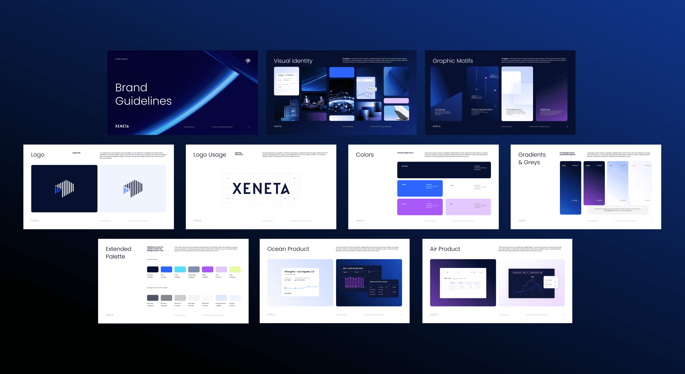
The 2022 identity covered palette, typography, a motif system and platform photography, and the 2023 website revamp put it into the highest-traffic surface. From there the work moved from identity to system: a consolidated asset library, Figma workflows, PowerPoint and Word templates, and icon and chart standards.
From 2025 the brand was rebuilt as tooling. A brand skill, a presentation builder with buyer-journey logic, and chart and one-pager builders let sales, product and analyst teams produce on-brand work without a designer in the loop.
2022
Identity
Rebrand and website
Brand fit the new price
2023 to 2024
Systems
Templates and asset library
Consistent baseline, still designer-led
2025 to 2026
Tooling
Brand skill and builders
Teams produce without a designer


Results
The rebrand was a precondition for the move upmarket rather than the cause of it, so the fair measure is whether the brand stopped being an obstacle. The pricing structure went into market and held. The system now reaches into the sales conversation rather than stopping at marketing.
Webinar demo requests
19 of 171
Decks consolidated
50+
Next case
From static to motion
02 →